Color is a powerful tool that can transform the mood and atmosphere of any space, making it an indispensable element of interior design. Whether you’re aiming for a serene sanctuary or a vibrant, energetic atmosphere, understanding and applying color rules can elevate your Long Island home. Let’s delve into some fundamental principles that can guide you through the art of color in interior design.
Interior Design Color Rules
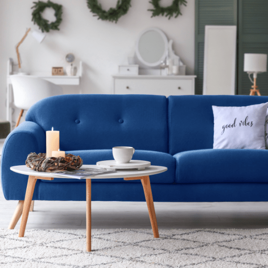
The Rule of Three: Dominant, Secondary, and Accent Colors
An effective color palette typically consists of three key elements: a dominant color, a secondary color, and an accent color. The dominant color sets the overall tone of the room, the secondary color complements it, and the accent color adds a pop of excitement. For example, in a calming bedroom, a soft blue can serve as the dominant color, a light gray as the secondary, and a touch of mustard yellow as the accent.
The 60-30-10 Rule: Balancing Proportions
This rule is a tried-and-true formula for achieving visual balance in a space. Allocate 60% of the room to the dominant color, 30% to the secondary color, and 10% to the accent color. This balance ensures that one color doesn’t overpower the others, creating harmony and cohesion in the overall design.
The Color Wheel: A Guiding Light
Understanding the color wheel is paramount in interior design. Complementary colors, positioned opposite each other on the wheel, create a dynamic and vibrant contrast. Analogous colors, situated next to each other, provide a harmonious and cohesive look. Triadic colors, forming an equilateral triangle on the wheel, offer a balanced and visually interesting palette.
Consider the Mood: Warm vs. Cool Tones
Colors can be broadly categorized into warm and cool tones, each evoking distinct moods. Warm tones like reds, yellows, and oranges create a cozy and inviting ambiance, ideal for living rooms and dining spaces. Cool tones such as blues, greens, and purples impart a sense of calm and sophistication, making them perfect for bedrooms or offices.
Neutral Foundations: A Timeless Canvas
Neutral colors, such as whites, grays, and beiges, serve as versatile foundations in interior design. They provide a timeless backdrop that allows you to experiment with pops of color through furnishings, accessories, and artwork. Neutrals also enhance the perceived size of a room, making it feel more open and spacious.
Mastering color rules in interior design opens up a world of possibilities to create spaces that are not only aesthetically pleasing but also reflect the desired mood and functionality. By understanding the principles of color harmony, balance, and contrast, you can confidently wield the palette to turn any space into a masterpiece of design. So, let your creativity flow and paint the canvas of your home with the hues that resonate with your style and personality.